Is this a good sign?
Sanford Lab's Environment, Safety and Health team on combating sign fatigue and improving sign literacy in the workplace
Why so many signs?
What signs do you see every day? The stop sign at the end of your block? The speed limit sign in a school zone? A tornado shelter evacuation plan sign in the hallway next to the water cooler? Sometimes, we see so many signs each day, that the signs intended to get our attention or warn us of potential danger, can blend in with the noise of the workplace. This is called sign fatigue.
“Our first goal is hazard elimination, whether through substitution or engineering. In some circumstances, such as an active construction zone where hazards like machinery or moving objects are a part of the work, hazards must be mitigated using administrative tools including signs,” said Larry Jaudon, director of Environment, Safety and Health team (ESH) at Sanford Underground Research Facility (Sanford Lab).
While using elimination or engineering solutions allows you to address the hazard directly, safety signage addresses the person, expecting them to acknowledge the hazard and conduct themselves safely. Consequently, sign fatigue or inattention in the workplace can lead to accidents.
“If signs are vague, not describing the degree of danger or type of hazard present, their message could be overlooked,” said Jaudon. “Someone with sign fatigue may see a sign that reads ‘Authorized personnel only’ and assume they are authorized to deal with whatever hazards are present, without full understanding the degree of danger.”
This is why clear, universal signage is vital to workplace safety.
“Our signs are designed according to a national standard, providing you with the magnitude of the danger, a pictogram that tells you what the hazard is and more information about how to address the hazard,” said John Scheetz, environmental manager at Sanford Lab. Safety signs at Sanford Lab follow the American National Standards Institute-Z5353.2 (ANSI) standard, which provides “an effective means of communicating information concerning hazards to an observer so that injury resulting from the hazard can be avoided.”
Understanding ANSI signage
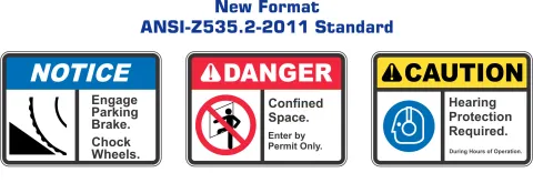
Still, a sign is only as good as its reader. Here is a quick guide to understanding ANSI safety signs at Sanford Lab. Each ANSI safety sign has three panels identifying (1) the level of danger present, (2) the type of hazard and (3) additional information on how the hazard should be addressed.
- Level of danger
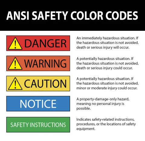
The top panel is a colored rectangular bar with six possible colors, each indicating the degree of hazard present. Inside the colored box are signal words that correspond to the color. For instance, a red box at the top of a sign is accompanied by the word “DANGER” and denotes a high-risk (possible death) hazard. The color orange is accompanied by the word “WARNING,” and the color yellow is accompanied by the word “CAUTION.” Each of these colors and signal words denote a decreasing risk level.
Additionally, some the signal words — “DANGER,” “WARNING” and “CAUTION” — include a safety alert symbol. This symbol is a triangular shape enclosing an exclamation mark preceding the hazard signal word and is used to further denote the three higher degrees of hazard.

- Type of hazard
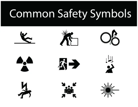
After determining the degree of the hazard, the left side panel provides a pictogram to help the viewer understand the type of hazard present. By using simple, geometric forms, these symbols effectively communicate the hazard or the results of the hazard on an international scale, whether or not the viewer can understand the sign’s language.
The following graphic shows common safety symbols.

- Additional information
Once you understand the magnitude and type of hazard, you’ll need to know how to proceed with the work you want to accomplish. The final message panel is on the right side. This is the part of the sign that identifies of the hazard in written language; advises how to avoid the hazard; and provides probable consequences of not avoiding the hazard.
An example of message panel might read: “Moving parts can crush and cut. Keep out during operation. Lockout power before entering.”
Putting it all together
By designing simple, consistent signage, teams can ensure employees will be able to gather enough information from safety signs.

The Environment, Safety and Health Department at Sanford Underground Research Facility promotes health and safety in the workplace, as well as healthy living and wellness for all employees. If you have questions about health and wellness, please contact our occupational health nurse, Laura Baatz, who is onsite daily at lbaatz@sanfordlab.org.
